How to Center a Div with CSS?
July 7, 2024
To center a div with CSS, there are many ways to do it. In this article, we will introduce five ways to center a div with CSS.
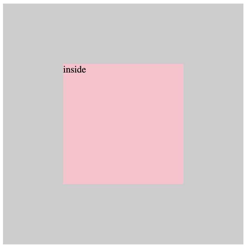
- The first 6 ways are used to center a div element horizontally and vertically in a container. The screen is as follows:
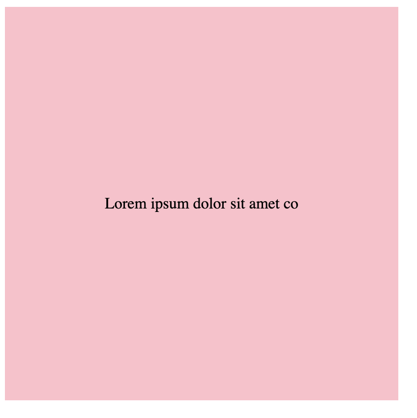
- The 7th method is used to center a line of text horizontally and vertically in a container. The screen is as follows:
Looking to practice more frontend interview questions? We recommend GreatFrontEnd, the best platform for honing your frontend interview skills!
7 Ways to Center a Div with CSS
In the following, we will see the implementation and explanation of these seven ways:
1. Use display: flex + align-items: center + justify-content: center
- Set the parent element display to flex
- Set the align-items property to center, which means that the child elements are vertically aligned in the middle of the parent element
- Set the justify-content property to center, which means that the remaining space is evenly distributed on both sides of the child elements, and the child elements are horizontally aligned in the middle
<div class="outside">
  <div class="inside">inside</div>
</div>
.outside {
  width: 400px;
  height: 400px;
  background-color: #ccc;
  display: flex;
  align-items: center;
  justify-content: center;
}

.inside {
  background-color: pink;
  height: 200px;
  width: 200px;
}v
2. Use display: flex + margin: auto
- Set the parent element display to flex
- Set the child element margin to auto, which will horizontally and vertically align the child element to the middle
<div class="outside">
  <div class="inside">inside</div>
</div>
.outside {
  width: 400px;
  height: 400px;
  background-color: #ccc;
  display: flex;
}

.inside {
  background-color: pink;
  height: 200px;
  width: 200px;
  margin: auto;
}
3. Centering with margin-inline
Besides using display: flex, there are other ways to use margin for centering. By setting both margin-left and margin-right to auto, the browser will automatically distribute the available space on the left and right sides, pushing the element to the center. Make sure to use max-width: fit-content to ensure the element's width doesn't stretch horizontally beyond its content.
.element {
  max-width: fit-content;
  margin-left: auto;
  margin-right: auto;
}
Additionally, CSS offers the margin-inline property, which is equivalent to setting both margin-left and margin-right at the same time. Therefore, the above CSS can be rewritten as follows:
.element {
  max-width: fit-content;
  margin-inline: auto;
}
4. Use display: grid + place-content: center
- Set the parent element display to grid
- Use the place-content property in the parent element, and set its value to center, which will center its child elements in both the horizontal and vertical directions
<div class="outside">
  <div class="inside">inside</div>
</div>
.outside {
  display: grid;
  place-content: center;
}
Note
The place-content: center property is actually equivalent to setting the justify-content and align-content properties of the grid container to center at the same time. The justify-content property controls the horizontal alignment, and the align-content property controls the vertical alignment. Therefore, by setting the justify-content and align-content properties to center at the same time, you can achieve the effect of aligning all the elements in the grid container horizontally centered and vertically centered.
5. Use position: absolute + top: 50% + left: 50% + transform: translate(-50%, -50%)
- Set the parent element to position: relative, which is convenient for calculating the relative position of the child element
- Set the child element to position: absolute, which will be positioned relative to the nearest positioned parent element
- Set the top property to 50%, which will move the top edge of the child element to the middle of the parent element
- Set the left property to 50%, which will move the left edge of the child element to the middle of the parent element
- Set
transform: translate(-50%, -50%), which will move the child element to the left and up by 50% of the distance, so that it is vertically and horizontally centered
<div class="outside">
  <div class="inside">inside</div>
</div>
.outside {
  width: 400px;
  height: 400px;
  background-color: #ccc;
  position: relative;
}

.inside {
  background-color: pink;
  height: 200px;
  width: 200px;
  position: absolute;
  top: 50%;
  left: 50%;
  transform: translate(-50%, -50%);
}
Note
The position: absolute usage is recommended to refer to this article for explanation. In short, when the position of an element is set to absolute, it will be positioned relative to the nearest positioned parent element.
The top: 50% and left: 50% properties are used to set the top and left edges of the element to the middle of the parent element. The transform: translate(-50%, -50%) is a transformation property in CSS, used to translate elements. Its effect is to translate the element 50% of its width horizontally and 50% of its height vertically.
Because we set the top and left properties of the element to 50%, the center point of the element has already been in the center of the parent element. However, since the default alignment of the element is the upper left corner, the upper left corner of the element coincides with the center of the parent element. Therefore, we use transform: translate(-50%, -50%) to translate the element back to the center, so that the element is completely centered.
6. Centering in the Browser Window
Beyond centering elements within their parent containers, we often need to center elements within the browser window itself. This is particularly common for elements like banners that are fixed to a specific position in the browser. Here's how you can do it:
.element {
  position: fixed;
  inset: 0px;
  margin: auto;
}
By using position: fixed, we anchor the element within the viewport. The inset: 0px property sets the top, right, bottom, and left offsets to zero, effectively stretching the element to cover the entire screen. Then, by applying margin: auto, the element is centered within this space.
7. Use text-align: center + line-height
- Set the parent element to
text-align: center, which means that the text is horizontally centered - Set the line-height property of the child element to the same height as the parent element, which means that the text is vertically centered in the element
<div class="outside">
  <div class="inside">inside</div>
</div>
.outside {
  width: 400px;
  height: 400px;
  background-color: #ccc;
  text-align: center;
}

.inside {
  background-color: pink;
  line-height: 400px;
}