What units are there in CSS? How do I use them?
October 6, 2022
In CSS, there are many different units, such as: px, em, rem, etc. During the interview, you may be asked about the difference between these units in CSS and how to use them in what context.
The difference between px, em, rem
px: The most common unit, also an absolute unit. According to MDN, the actual length of 1px will be 1/96 of an inch.
em: It is a relative unit. It is calculated differently when used in fonts and general length units. The following explanations are based on two different scenarios.
- Used in font-size: It will be multiplied according to the font size of the parent layer. For example:
font-size: 2emmeans that the font size of the current element is twice the font size of the parent element. - Used in width: it will be a multiple of the font size of the current element. For example, when
width: 2emis set, width will be the font size of the current element multiplied by 2. If the font size of the element is10px,widthwill be is20px. If the font size of the element is not set, the font size of the parent element will be used by default. In other words, if the font size of the parent element is30pxand we have not set the font size of the element, thenwidth: 2emwill be is60px.
In the following code example, the font size in the div is 20px, because the parent element (body) is 10px, the 2em element of the div element will be set to 10px * 2. And div width will be 40px, because the font size of the element is 20px, so width: 2em, will be 20px * 2.
<!DOCTYPE html>
<html>
<head>
  <meta charset="utf-8">
  <title>JS Bin</title>
</head>
<body>
<div>em</div>
</body>
<style>
body {
  font-size: 10px;
}
div {
  font-size: 2em;
  width: 2em;
  height: 100px;
  border: 1px solid red;
}
  </style>
</html>
rem: Similar to em, it is also a relative unit. The full name of rem is root em. The root here refers to the root element, and the root element is html; in other words, rem is based on html for calculations. Its calculation is similar to em, except that no matter where rem is used, it is calculated based on the root element, not the parent element of the element.
In the following code example, the width of div or p will be 100px. Since the width of the root element (html) is 50px, 2rem will be 50px * 2.
<!DOCTYPE html>
<html>
  <head>
    <meta charset="utf-8" />
    <title>JS Bin</title>
  </head>
  <body>
    <div>
      <p>rem</p>
    </div>
  </body>
  <style>
    html {
      font-size: 50px;
    }
    body {
      font-size: 10px;
    }
    div {
      font-size: 2rem;
      width: 2rem;
      height: 100px;
      border: 1px solid red;
    }
    p {
      font-size: 2rem;
      width: 2rem;
    }
  </style>
</html>
How to choose px, em, rem?
The advantage of px is that it is an absolute unit, and the size and length can be set accurately during development, but the disadvantage is that it cannot be changed as the page size changes.
em and rem are relative units, which are more flexible than px. The existence of rem is mainly to solve a problem of em. Since there will be inheritance problems when using em, and each element will automatically inherit the font of its parent element size, if the layout design is multi-layered, it may cause confusion when using em.
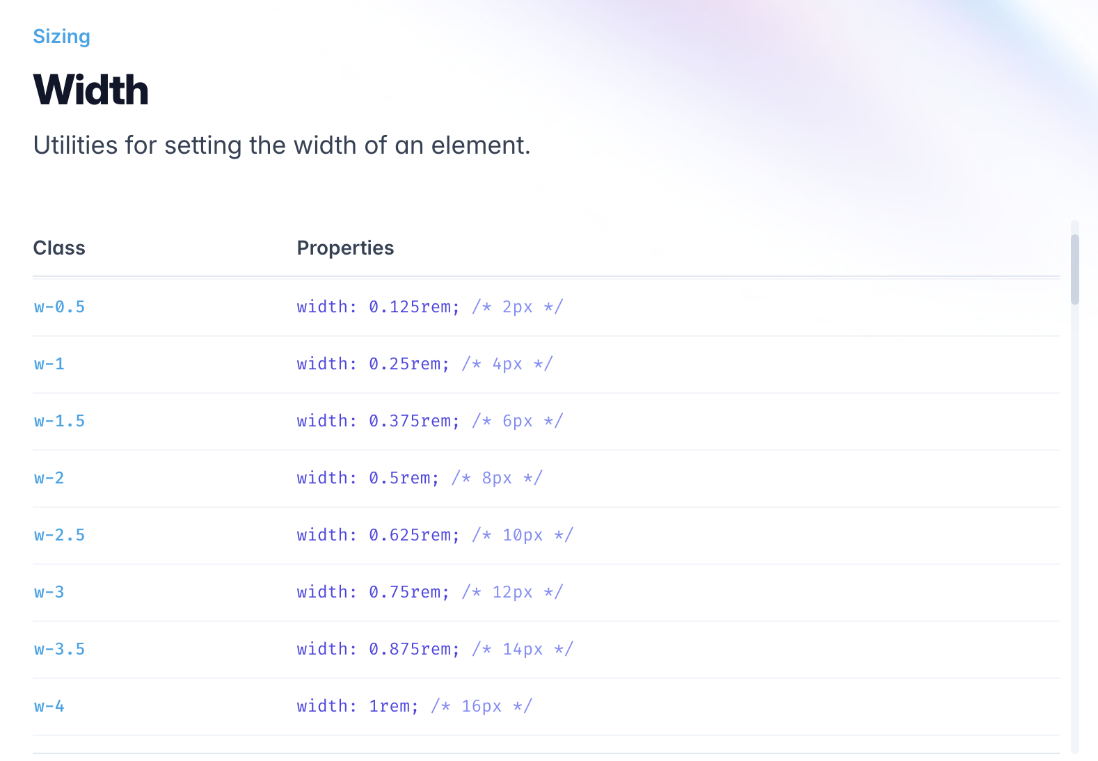
Using rem allows us to avoid this problem, regardless of any level of elements, the reference point for comparison will be the root element, which is suitable for use in RWD or mobile device development. In addition, some of the defined lengths of Tailwind CSS, a very popular CSS framework in recent years, also use rem for calculation, as shown in the image below.