What are pseudo-classes and pseudo-elements?
February 2, 2023
Pseudo-classes
Pseudo-classes are keywords added to selectors that specify a special state of the selected element(s). For example, the :hover pseudo-class applies when the user mouses over the element.
Four common pseudo-classes
:hover
When the user's mouse or touchpad device is placed on the element, we can use :hover to change the style of the element.
:link, :visited
:link and :visited are used on <a> elements that contain the href attribute. :link can adjust the style of the link that the user has not browsed, and :visited can change the style of the link that the user has browsed.
<a href="https://google.com">google.com</a>
<a href="https://www.explainthis.io">explainthis.io</a>
a:link {
  color: blue;
}

a:visited {
  color: red;
}

:disabled, :enabled
If you want to set a button element to the disabled state, you can use :disabled and :enabled to adjust the style of the button when it is in the disabled or enabled state.
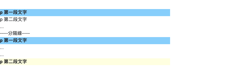
:first-child, :last-child
If you want to find the first or last item in HTML, you can use :first-child and :last-child. These pseudo-classes will return the first or last element in a group of sibling elements.
<div>
  <p>first p</p>
  <p>second p</p>
  <div>...</div>
</div>
<div>----------------</div>
<div>
  <p>first p</p>
  <div>...</div>
  <div>...</div>
  <p>second p</p>
</div>
p:first-child {
  background: lightskyblue;
  font-weight: bold;
}

p:last-child {
  background: lightyellow;
  font-weight: bold;
}
Pseudo-elements
Pseudo-elements can be used to add additional elements to the document without having to add additional HTML. It has many uses, which we will introduce in the next section.
Four common pseudo-elements
::before, ::after
When we use ::before and ::after pseudo-elements on an element, a child element will be generated in the element, but the content must be defined in the pseudo-element, which can be any string, even an empty string.
At the same time, we can also adjust the style of the content, as shown in the following code.
<span class="text">This is ExplainThis</span>
.text {
  background-color: #171923;
  color: white;
}

.text::after {
  content: " ♥ Interview Guide";
  background-color: #ffba10;
}

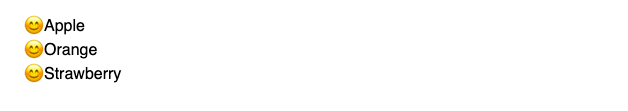
::marker
Using ::marker can adjust the style of the list or summary item (summary) symbol and number.
<ul>
  <li>Apple</li>
  <li>Orange</li>
  <li>Strawberry</li>
</ul>
ul ::marker {
  color: red;
  content: "😊";
}
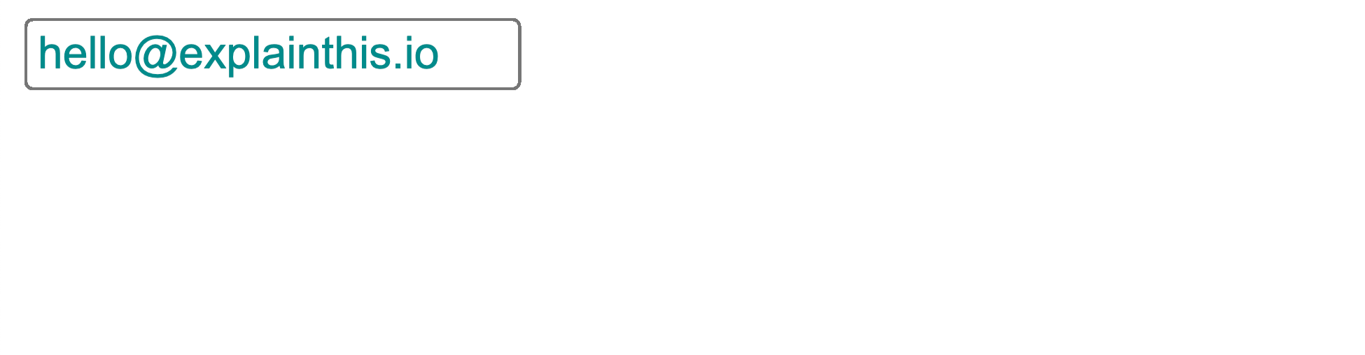
::placeholder
When we are designing forms, we will add some elements, such as input, with placeholder text, and ::placeholder can be used to set the style of this placeholder text.
<input type="email" placeholder="[email protected]" id="email" />
input::placeholder {
  color: darkcyan;
}
::first-letter
We can use ::first-letter to set the style of the first letter of the text.
<p>Hello ExplainThis</p>
p::first-letter {
  color: orange;
}