CSS 水平垂直置中的方法 (flex, grid)
2024年7月7日
將元素置中基本上是 CSS 面試題中的基本題,面試官基本上會從面試者回答的方式和內容來判斷對於 CSS 排版的熟悉程度。但元素置中的做法其實有非常多種,不需要到每一種都要會,但建議可以熟練幾種自己最擅長的作法。
本篇文章會介紹其中五種方法。
第 1 ~ 第 6 種方法適用於,在一個容器內水平垂直置中一個 div 元素,畫面如下:
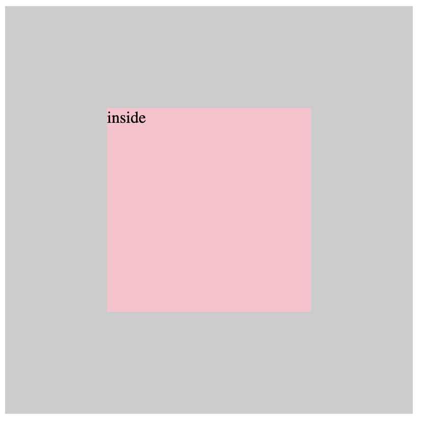
水平垂直置中一個 div 元素 第 7 種方法適用於,在一個容器內水平垂直置中一行文字,畫面如下:
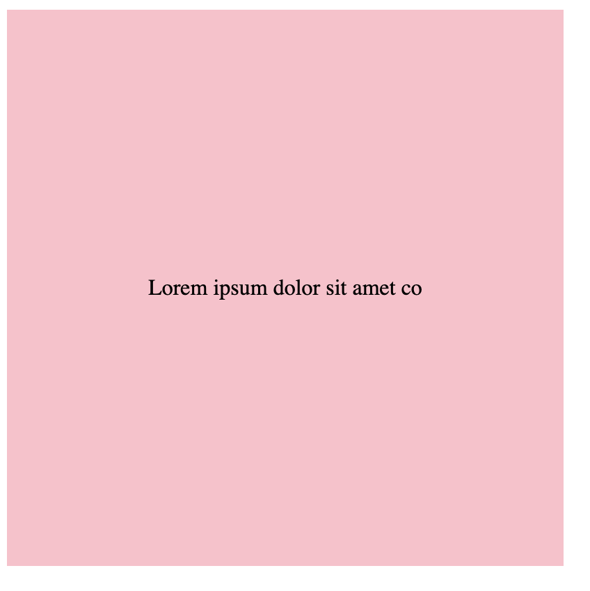
水平垂直置中一行文字
如果想練習更多題目,推薦可以到 GreatFrontEnd 上練習
CSS 水平垂直置中的 7 種方法
以下我們來看這七種方法的實作和講解:
1. 使用 display: flex + align-items: center + justify-content: center
- 將父層元素 display 設置為 flex
- 設置 align-items 屬性為 center,表示在父層元素中將子元素垂直對齊到中間
- 設置 justify-content 屬性為 center,表示在父層元素中將剩餘空間均分在子元素的兩側,將子元素水平對齊到中間
<div class="outside">
  <div class="inside">inside</div>
</div>
.outside {
  width: 400px;
  height: 400px;
  background-color: #ccc;
  display: flex;
  align-items: center;
  justify-content: center;
}

.inside {
  background-color: pink;
  height: 200px;
  width: 200px;
}v
2. 使用 display: flex 和 margin: auto
- 將父層元素 display 設置為 flex
- 將子元素 margin 設置為 auto,將子元素水平垂直對齊到中間
<div class="outside">
  <div class="inside">inside</div>
</div>
.outside {
  width: 400px;
  height: 400px;
  background-color: #ccc;
  display: flex;
}

.inside {
  background-color: pink;
  height: 200px;
  width: 200px;
  margin: auto;
}
3. 透過 margin-inline 來置中
除了搭配 display:flex,margin 還有其他搭配方式。只要把 margin-left 跟 margin-right 都設定成 auto,這樣意味著,會把左邊與右邊都有的空間都變成 margin,這樣就會把元素往正中間擠。注意,這邊要搭配 max-width: fit-content 來確保元素的水平會固定在元素的寬度,不會往水平拉長。
.element {
  max-width: fit-content;
  margin-left: auto;
  margin-right: auto;
}
另外 CSS 有一個 margin-inline 可以使用,它會等同於同時設定 margin-left 與 margin-left,因此上面的 CSS 可以改寫成下面這樣
.element {
  max-width: fit-content;
  margin-inline: auto;
}
4 . 使用 display: grid + place-content: center
- 將父層元素 display 設置為 grid
- 在父層元素中使用 place-content 屬性,將其值設置為 center,它將在水平和垂直方向上置中其子元素
<div class="outside">
  <div class="inside">inside</div>
</div>
.outside {
  display: grid;
  place-content: center;
}
補充說明
place-content: center 實際上等同於同時將 grid 容器的 justify-content 和 align-content 設置為 center。 justify-content 屬性控制了水平對齊,而 align-content 屬性控制了垂直對齊。所以,通過將 justify-content 和 align-content 同時設置為 center,可以實現將 grid 容器中的所有元素都水平置中並垂直置中對齊的效果。
5. 使用 position: absolute + top: 50% + left: 50% + transform: translate(-50%, -50%)
- 設置父層元素為
position: relative,方便計算子元素的相對位置 - 設置子元素為
position: absolute,它會相對於最近的已定位的父層元素進行定位 - 設置 top 屬性為 50%,將子元素的上邊緣移到父層元素正中間的位置
- 設置 left 屬性為 50%,將子元素的左邊緣移到父層元素正中間的位置
- 設置
transform: translate(-50%, -50%),將子元素向左上方移動 50% 的距離,使其垂直和水平置中對齊
<div class="outside">
  <div class="inside">inside</div>
</div>
.outside {
  width: 400px;
  height: 400px;
  background-color: #ccc;
  position: relative;
}

.inside {
  background-color: pink;
  height: 200px;
  width: 200px;
  position: absolute;
  top: 50%;
  left: 50%;
  transform: translate(-50%, -50%);
}
補充說明
position: absolute 的用法建議參考這篇說明。簡而言之,當一個元素的 position 設置為 absolute 時,它會相對於最近的已定位的父層元素進行定位。
而 transform: translate(-50%, -50%) 是 CSS 中的變換屬性,用於對元素進行平移。它的作用是將元素在水平方向上平移自身寬度的 50%,在垂直方向上平移自身高度的 50%。
由於我們將元素的 top 和 left 設置為 50%,元素的中心點已經在父元素的中心位置了。但是,由於元素的默認對齊方式是左上角,所以元素的左上角與父元素的中心重合。因此,我們通過使用transform: translate(-50%, -50% 將元素平移回其中心位置,從而使元素完全置中對齊。
6. 在瀏覽器視窗置中
除了針對元素與其父元素,我們很常會需要直接在瀏覽器視窗的可視範圍置中,例如常見的固定在瀏覽器某個位置的橫幅 (banner),可以用以下方法
.element {
  position: fixed;
  inset: 0px;
  margin: auto;
}
透過 position: fixed 我們可以將元素固定在視窗中,而 inset: 0px 則是設定上下左右都為 0,這樣會把整個元素拉到全畫面,這時候再搭配 margin: auto 就能讓元素置中。
7. 使用 text-align: center + line-height
- 設置父層元素為
text-align: center,使文字水平置中 - 設置子層元素 line-height 與父元素同高,使文字在元素中垂直置中
<div class="outside">
  <div class="inside">inside</div>
</div>
.outside {
  width: 400px;
  height: 400px;
  background-color: #ccc;
  text-align: center;
}

.inside {
  background-color: pink;
  line-height: 400px;
}